Final Exhibition

My final show is now installed. The culmination of two years of practical engagement and academic research. The work on the walls have been produced rapidly over the last 2 months but they are not end results they are exploratory experiments.

I discovered the most important elements to my practice and the media to express them very late on, there are many areas to develop. I aim to continue exploring my interests more intimately without the pressures and stresses of deadlines and learning outcomes.

Below me and my friend Harry are hanging the work, deciding on the best positioning, difficult with work this scale.

20130813_110347-1-1 20130813_113755

The most stressful part of putting up the exhibition was revealing my work to everyone, it made me feel physically sick to be exposed so publicly (a sublime terror perhaps?). It is strange that I don’t feel that way about putting work on my blog which has a world-wide audience! Thankfully the people around me have been wonderfully supportive helping me feel more positive.

Hanging the work was gruelling, what I thought would take a couple of hours turned into a couple of days. I am not entirely satisfied with the results, the fabric does not hang straight due to the processes they have gone through and the different types of pigment applied (there were no right angles). ideally more space around each piece would enhance the aesthetic appeal. I am pleased with the scale I worked on but wish I had made all the pieces exactly the same size. This would have made it much easier to hang and given coherence to the overall look of the show.  The hanging system I devised was succesful as it gives the impression that the work is unsupported and floating.

I am very happy with how the digital drawings look displayed in a loop on a computer monitor. The vibrancy of the colours and luminosity of the back lighting make the images appear to pulsate and glow. An improvement here would have been to box the monitor in to hide the computer branding and heavy stand which detracted from focus on the artwork.

20130813_094103-1

I had an extra wall to display something on so I framed a couple of smaller, softer, quieter pieces as contrast; I think work well in the space.

DSC06917

Here are the finished results. I hope that I get some positive feedback from the work. I am interested to know how the public react to it and what they read into the pieces.

20130814_122924-1 20130814_122940

Posted in Practice | Tagged , , , , , , | 3 Comments

Final preparations……..

The last few days have been spent organising the housekeeping for the final exhibition and hand in.

The critical reflection is finally finished, I found this the most challenging part of the module.

A photographer friend took brilliant photographs of all my work and put files in different formats for publicity etc.

I selected five photographs of details of my work and took them to the printers, I have ordered 10 x A5 postcards of each image.

P1160610 A6 3P1160590 A6 2

P1160582 A6 1 P1160573 A6 3 1 A6

The precise to Module 5 is in progress and I hope to have it finished by the weekend.

I have ironed all the fabrics so they are neat, I decided to fold over the edges so that the works look more like paintings than textile pieces.

I worked on one last piece this afternoon, after reviewing my work yesterday  I wanted to produce something even more extreme in colour, with real impact. It is inspired also by my digital drawings, the new larger phone I have makes the drawings so vibrant and is even more pleasurable to work on. I notice haw much my colour pallet has shifted from work produced only a few months ago. I have become much more confident with the media and my approach to application of dye. Here my chosen fabric was the silk/linen mix and I worked on wet fabric to assist the blurring of the colours.

last piece

I have devised a method of hanging my work that will be totally unobtrusive. I will roll and secure each end around hollow plastic piping. This will be cut exactly to the length of the fabric. I will then thread fishing wire through the tube. The fishing wire will be secured to tiny pins nailed to the top of the display board and as near to the floor as possible at the bottom. I hope that this will hold the fabrics taut and flat so they don’t flap around. I am worried about how they will look as a coherent selection of work and wonder of I will be disappointed. I would love to see them with fresh eyes.

All being well I will hang my work on Monday. I printed out photographs of all the final pieces so that I could see then all together without having to unroll and manhandle the large work. This helped me to see which pieces will work together for the exhibition and which I will reject. Below are some images taken when the whole MA group got together to review tha foyer space and discuss how it would best be used to accommodate everyone happily. I am holding a piece of work against my space to get an idea of scale and how many pieces I will be able to fit in it.

IMAG7091 20130705_105750


I am having a slide show put together of all my digital drawings in a loop. This will be displayed on a computer screen near my fabric work.

My blog has been printed ready for hand in but I need to take all my written work to be bound first.

And finally I booked a holiday ………………………………………………. !

Posted in Practice | Tagged , , , , , , , , , | Leave a comment

Statement

I have produced a short statement to go into the M.A. exhibition catalogue and onto the group website

This briefly summarises my practice, concentrating on the latest developments involving fluorescent pigment.

Statement

Repetitive visits to record my response to the minimal view across the River Humber motivate this series of work. My obsession for this place induces a strong sense of the sublime. The subject remains the same, but the light and atmosphere are changing constantly and so too my visual reactions to it.

My aim is to communicate these intense feelings by providing an emotional incident for the viewer. Attempting to capture the ethereal qualities of luminosity and light sustain my engagement with fluorescent pigment. Edmund Burke defined the sublime as an internal discord of the mind and the senses inability to comprehend a phenomenon. Chaotic visual experiences are challenging for the brain as beta brainwaves throw the mind into a state of anxiety and stress. I intend the use of fluorescence and pulsating colour contrasts in my work to induce sublime experiences for the onlooker.

“Nobody can paint the sun or sunlight. He can only paint the tricks that shadows play with it, or what it does to forms. He cannot even paint those relations of light and shade – he can only paint some emotion they give him, some man-made arrangement of them that happens to give him personal delight” Willa Cather 1925


Posted in Practice | Tagged , , , , , , | Leave a comment

The Sublime, Fluorescence and Complementary Ratios

Thinking about why the dramatic skies appeal so much to me, I consider it to be down to the contrasting complementary colours seen during certain meteorological events or times of day, particularly sunset.

I came across this very insightful website explaining ratios of colour. Although the information on the website is for photography (so concerning light not pigment), I immediately identified with these proportions of colour as they have already appeared naturally in the compositions of my latest work.

Complementary Ratios

Showing the relative intensities of complementary colours.

While Red and Green are roughly equal in their effect on each other Orange and Blue need about a 3:1 ratio for the same balance. With Yellow and Violet it’s about 5:1. 

I know from my teaching of colour theory that this balance is very pleasing to the eye because it occurs naturally in nature.

Getting these proportions right in a piece of work can enhance the appeal to the viewer.

I wonder how much these ratios will be effected, if at all, when fluorescent colour is thrown into the equation?

Fluorescent compounds convert incoming light of one wavelength into (visible) light of another wavelength, so the material seems to “glow” with a colour corresponding to the wavelengths being emitted. This glow is the major appeal of the dye I am using as it is achieving the intensity of the light I see in the atmospher of the landscape I am trying to capture.

Harmony of colour engages the viewer creating balance to the visual experience. If the visual experience is very bland the brain will be under-stimulated and so not engage with the image. However if it is really chaotic with no logical structure it becomes too difficult to translate and so the visual experience is challenging. So balance of harmony is vital to the viewers enjoyment of visual stimuli. 

Could this suggest that the use of fluorescent colours will be too extreme to create an engaging visual experience?

I intend the work to be an assalt and demand attention so hope that the visual confusion to the brain will produce a sense of the sublime  from the viewer.

DSC06505


Posted in Research | Tagged , , , , , , , , , , , , , , | 5 Comments

Day-Glo Claude Mirror

My research has led to an interest in the Claude mirror.

‘A pre-photographic, landscape-viewing device, used by romantic artists and connected with the Picturesque Movement. The artists stood with their back to the scene looking at it through the small black convex mirror. The reflection framed and transformed the view, distorting perspective, altering colour saturation and compressing tonal values. This resulted in a loss of detail but gave an overall unification of form and line.’

The seeming absurdity of refracting and reflecting nature in this fashion is balanced by the beauty and seductiveness of the mirror’s optical effects.

The Claude mirror references the relationship between desire and the fabrication of place, between the body and the environment. Linking the mirror with contemporary popular culture, tourism, snapshots, web-based security and surveillance technology, exposes the ongoing mediation of nature through technologies of vision.

It reveals the layered, culturally determined nature of the gaze. It draws attention to the complex mediation between looking and mark-marking, framing and representation, as well as the many interventions that occur between apprehending and understanding landscape. (Extract from here an interesting project to revive this device)

Claude Mirror

Claude Mirror

I discovered this website describing how to make your own Claude glass from a convex lens. This made me consider a way subvert this process and what effect would be attained by  painting the lens with fluorescent colour instead of black.

Today I acquired a lens from an old OHP projector and painted it with the flourescent orange. Here is the result.

Flurescent claude mirror

Fluorescent Claude Mirror

I consider the object to be a beautiful thing in its own right reflecting the light in the glass roof in a compelling manner.

P&O ferry viewing car park Hull

P&O ferry viewing car park Hull

I visited the ferry viewing car park this evening to try out the mirror and see how the view looked through it. The results were not too strong and quite hard to see from certain angles.

DSC06529 DSC06530

I think this might have been because the sunset was so bright, I believe I will get better results with more even lighting conditions. I can see possibilities for development here and so will continue to explore.

Posted in Practice, Research | Tagged , , , , , , , , | 1 Comment

Making Progress

I am continuing to work on my silk pieces. I work on two at a time so that I am not idle during the drying time. I have noticed that I have two distinctly different ways of working. The first is to approach the fabric in the same way as a painting so apply the dye directly with a brush, sponge or roller as in this piece. I also use water to soften some of the harsh edges.

DSC06512

This method seems to work best on the thicker silk/linen fabric. The other way I work is more about manipulating the fabric, dipping, folding, bleeding, shibori and discharge. This is a more organic approach with softer but much less predictable outcomes.

DSC06508

DSC06510

DSC06519

As I gain momentum I become much more confident with the fabric and daring in the application of techniques and processes. As I go along I am also learning how to handle the flourescent dyes and how they react to the fabric being wet or dry and how they change when layer are applied on top. I find this new media extreamly engaging and inspiring which motivates me in the production of these pieces.

Posted in Practice | Tagged , , , , , , , , , , , , , , | Leave a comment

Exhibition: Planning and Making

The area allocated for the MA cohort to exhibit is the entrance foyer of Hull School of Art and Design and there will be eight graduates showing in this space. As it is a working environment it is rather different to the white cube which was the perfect space I had envisioned to show my final pieces to best advantage. Having said that I am still very happy with the area given to me.

DSC06496

DSC06499Although the area looks large, because of the scale of my work, I will only be able to fit about six pieces in it. I aim to produce at least twelve final pieces and from these select the ones that work best together as a series and fit in the space well. My space is next to the main reception area so very prominent, my work will be the first thing people see when they walk into the building. The pressure is on to achieve the eye-popping effects I am hoping will create a reaction from the viewers. Another advantage is the directional lighting available which I hope will enhance the intensity of colour and reflect the lustre of the silk.

DSC06493

I am continuing to produce large pieces approx 160cm in length. I am working on three different types of fabric, my initial choice of 100% Habotai silk and two new surfaces; 100% twill silk and Dakota silk linen mix. The twill silk, above, is pure white so the colours appear bright and vibrant it also has a high sheen that reflects the light beautifully. The fineness of the fabric is perfect for folding and manipulating to achieve interesting variations in tone and texture. The dye is harder to control on this fabric as it bleeds a lot but this produces the soft transient effects an am striving for.

DSC06504

Initially I was not keen on the silk linen mix when making samples. It has a creamy colour, the surface is dull lacking the sheen of the 100% silk and there is a blue line woven into the selvedge down both sides. However the more I worked with it the more I appreciated its qualities. The creamy background gave a subtle and rich tone to the deeper hues whilst maintaining the brightness required for the neon colours. The blue lines softened with the application of dye and in some cases practically disappeared. The extra weight and density of the fabric, although too thick to manipulate satisfactorily, bled less than the silk so application was easier to control. This fabric was also much wider so offering more scope for compositional arrangements.

DSC06507I continue to be immensely inspired by the fluorescent dyes. I am totally enamoured by the luminosity of light they project, I find pleasure in how they apply to the fabric and love the resist when dye is applied on top of it.

Although still interrupted by lecturing duties it feels goo to have more time to become immersed in the development and processes as the work evolves.

DSC06506

I am applying the dye quickly and spontaneously, letting the processes lead. For guidance I am directed by my rapid sketches and channelling the memory of being in the landscape. I have to wash the pieces in-between layers which is always nerve-wracking but I am usually pleasantly surprised by the results. From here I can re-work on areas that need more depth or use discharge on areas that need taking away. When I get to a satisfactory point I stop work and put the piece away to start on the next. When I have completed as many as I can I want to lay them all out to look at them with fresh eyes. I hope I will then know which ones need development to make them work.

DSC06505


Posted in Practice | Tagged , , , , , , , , , , | Leave a comment

Final Developments

There has been a meeting with the MA group to discuss the final exhibition. Now the space (the foyer of the Art School) has been organised and areas agreed. I have a good space I am happy with, it has a stretch of clean white walls all ready for hanging my large pieces. My first task his week was to produced lots small experiments in colour and composition from which I selected the outcomes I considered most sucessful and would best  work together as a series.

Ready for action !

Ready for action !

At last I have the studio to myself so can spread out and work in the way that I want. Here are a few of the small compositions I produced. Some worked much better than others, the bolder less complicated ones with more intense colour contrasts appeal to me the most. I hope they will translate well into the large-scale.

DSC06412


This week I have also been  trying out some different fabric. I have worked on a silk/linen mix. This is heavier and stiffer than the 100% silk and slightly off white in colour. It was quite pleasant to work on and the bleeding was more controllable than the silk but when the dye dried It did not have quite the same luminosity. This fabric is wider than the silk so a square rather than oblong composition is achievable. The fluorescent dyes applied well to the stiffer fabric which I was pleased about and I enjoyed the resisting when painted on top of it. I used a decorating roller to apply the dye in rows.

Working on Silk/Linen mix fabric

Working on Silk/Linen mix fabric

Another fabric I have to try out tomorrow is 100% twill silk, it is heavier than the Haboti silk I have been using and has a slight texture to it which gives it a beautiful lustre. When I have tried out all three fabrics I will make a decision on which gives the strongest impact of colour and luminescence and use that to produce the rest of my pieces.

Posted in Practice | Tagged , , , , , , , , , , , , , | Leave a comment

Flurescent Abstract Silks

Here are some of my latest works, some of the final sample pieces before beginning work on the final collection.

DSC06402

I figure there will be room for eight large hangings in the space I have been allocated so I would like to produce double that to make sure I have enough to select from.

DSC06401

These will be 90cm x 150cm, I would like to do some 150 x 150 square pieces for more variety in composition  but I am limited to the width of the fabric chosen.

DSC06400

I am going to begin by working on some smaller compositions on paper and mixing the dyes so I have enough for the full set of silks.

Posted in Uncategorized | 3 Comments

Advise

Today a colleague and fine artist Ian came to look at my work. I really respect his judgment and felt relieved and reassured to have some constructive feedback from him.

The most interesting aspect of my work for him were the digital drawings produced on a basic mobile phone app. The shapes in these he liked because they seemed to be informed by the colour rather than compositional concerns. I believe this is a result of the limited language available to work with via the app.

He considered the large canvas paintings to be laboured and concerned too much with ‘design’. I agree with him on this point, they took several days to complete and lost the spontaneity  am striving for as a connection to capturing fleeting atmospheric conditions.

Ian thought that I should continue disregarding any sense of depth or perspective that could relate the work to representational concerns. I should concentrate on abstract composition, flatness of surface and the quality of the edges of forms ie the blurring and softness that has evolved.

He mentioned Kenneth Noland’s ‘One Shot’ paintings:

Kenneth Noland

In the early 1950s, Noland began producing a number of series, each of which explores a range of shapes and color arrangements and remains committed to his staining method as a means of overcoming the tactility of the canvas support with the opticality of pure color. Like Frankenthaler and Louis, Noland experimented with thinned, acrylic-based paints, which made it nearly impossible to revise or modify colors after the paint had penetrated the (unprimed) surface. To stress the care needed to execute these works, he referred to them as “one-shot” paintings.

“I wanted color to be the origin of the painting, I was trying to neutralize the layout, the shape, the composition . . . I wanted to make color the generating force.” 

Noland adopted the circle as a way to make a “single expressive entity,”

I see the relationship to my own way of working , to have enough work for the final show I will have to produce large number of pieces accepting that only a select few will be good enough to exhibit.

Another artist mentioned during out discussion and who I am deeply inspired by was Patrick Heron.

Patrick Heron gouache

Patrick Heron
gouache

Underlying every phase were his constant preoccupations: with colour as space; with line as an indicator of dynamic relations as well as of description of form; insistence on the primacy of decorative order in the composition of images that begin and end with the four edges of the paper or the canvas.  Heron used that most rare and uncanny of gifts: the ability to invent an imagery that was unmistakably his own, and yet which connects immediately with the natural world as we perceive it, and transforms our vision of it. http://www.artcornwall.org/profiles/Patrick_Heron.htm

This was a really thoughtful and supportive tutorial which reaffirmed and took forward the ideas already going around in my head. Thank you Ian


Posted in Inspiration, Research | Tagged , , , , , , , , , , , , , , , , , | Leave a comment

Latest Developments

As the end of the academic year workload eases I eventually have a bit more time to immerse myself in the final section of the Masters.

I have had to make some major decisions in the past few days as I have so many ideas and different facets to my work I need to decide which area I wish to develop.

The important areas to me are; painting on canvas, digital drawings, dyeing silk, painting on paper.

The canvas paintings I did at Easter have remained untouched due to lack of studio space and a sense of doubt about their quality. This week I stretched the first one to see if it would change how I felt about it.

DSC06343

I thought I would be pleased and excited by it when I saw it all tidily stretched but actually I was a bit disappointed and rather underwhelmed. This really panicked me and  made me question why I was painting onto canvas, I felt a strong need to reassess what I have been doing.

I am continuing to enjoy experimenting with digital drawings. Some good news is that I have managed to aquire an ipad on loan for a few weeks. This will enable me to experiment with the drawing app on a larger scale which hopefully will result in something new.

Most recently I have been inspired and exited by the use of fluorescent dyes. Throughout my investigations colour has been of utmost importance to my practice, it has been employed  in my attempts to capture the luminocity of light and drama of nature seen through meteorological events I witness in my chosen landscape.

Exploration of ye and fluorescent media on paper

Exploration of dye and fluorescent media on paper

The powerful impact and intensity of the fluorescent colour is joyous to me, I revel in exploring how it interacts with the dyes, particularly when bleeding together. I can see possibilities to push boundaries with concept of such unnatural colour inspiring the natural landscape. I am interested in contrasting and complimentary colour evoking abstract concepts of atmosphere and light. To work with these ideas on a larger scale using fabric I can manipulate manually inspires me in a way that the canvas does not.

I have begun to examine how the fluorescent medium reacts on the silk and with the dyes. To my delight I discovered that as the fluorescent media  lies on the surface of the fabric so when it dries it resists the procion dye which penetrate the fibres fully. I found out the strength of colour could be manipulated, producing different effects applying wet on wet, wet on dry or wet on partially dry.

Dip dying: Fluorescent red electric blue

Dip dying: Fluorescent red electric blue

I manipulated the application of media by both unpredictable dip dying and more controllable direct painting methods.

Fluorescent pigment dye applied over procion dye with areas of discharge.

Fluorescent pigment dye applied over procion dye with areas of discharge.

Fluorescent red with electric blue on habotai silk

Fluorescent red with electric blue on habotai silk

A pleasant side effect of the process is achieved as the dye bleeds through onto the blotting paper it is laid on.

Blotting paper placed underneath silk while applying dyes.

Blotting paper placed underneath silk while applying dyes.

So I am confident that this is the way forward for me, it feels right, I am excited and inspired by these processes and materials. I think that it is unique to me and I am on the verge of developing this as a personal style that I feel an intense connection with.

Posted in Practice | Tagged , , , , , , , , , , , , , , , , , , , , | 3 Comments

Peter Lanyon

Peter Lanyon Shy Deep, 1959

Peter Lanyon
Shy Deep, 1959

http://www.amazon.co.uk/Peter-Lanyon-At-Edge-Landscape/dp/1901785041

Here are extracts from the above book about the Cornish landscape artist Peter Lanyon. I found many parallels with his work and thinking but also new ideas particularly about the landscape being in constant state of flux.

Interested in natural phenomena – the weather.  “I like to paint places where solids and fluids come together such as meeting of sea and cliff, wind and rock”. Paints the quality peculiar to the feeling and experience of a place – immersion and attachment.

“My paintings are not abstract nor are they landscape. They use abstraction as a method and landscape experience as a source. They reject the conventions of landscape but remain recognisable in the country. They are concerned with environment rather than view and with air rather than sky”

Concepts of existentialism and phenomenology – susceptibility to outside forces.

Henri Bergson – theory of duration – time as perpetual flux not a series of static moments, identification with the space by walking in it; making contact. Subjective and objective (artist and environment) are a single continuum. The landscape is not static it is constantly changing and the artist moves around within the space to experience and investigate it.

Einsteinrelativity theory and the nature of existence.

Wanted art in which the spectator was an active participant. Sought to recreate experiences of place so the viewer could re-experience and interpret in their own way.


Posted in Inspiration, Research | Tagged , , , , , , , | 1 Comment

Jules Olitski

Jules Olitski Instant Loveland 1968 Acrylic paint on canvas

Jules Olitski
Instant Loveland 1968
Acrylic paint on canvas

Discovering the work of Jules Olitski has been truly inspirational and interesting to me for many reasons.

The work is about colour and light. It has a haunting, ethereal luminosity achieved through the application of paint with a spray gun. The paintings possess a glow through and celebrate purity of colour. Although the purely aesthetic quality of colour is the only subject matter to me the work has a strong association with landscape and in particular Turners most intense sunsets.

Scale is of great importance to the intensity of the viewer experience of these paintings. “Size guarantees the purity as well as the intensity needed to suggest indeterminate space: more blue simply being bluer than less blue.” Clement Greenburg

Olitski statement for the 1966 Venice Biennale, ‘Painting In Colour’: ‘When the conception of internal form is governed by edge, color … appears to remain on or above the surface. I think, on the contrary, of colour as being seen in and throughout, not solely on, the surface’.

Olitski said he would prefer ‘nothing but some colours sprayed into the air and staying there.’ The appeal of his paintings for me is that they have the feel of a cloud of intense atoms of colour suspended in front of your eyes.

“Because the seeing of the surface is tied to the perception of a kind of color which so opens and expands that surface toward the viewer that it might be characterized as foreshortened, the very seeing of the painting in all its literalness poses a question about where the surface is. To see Olitski’s color means to see the surface itself as elusive and unaligned. Rosalind Krauss

http://www.tate.org.uk/art/artworks/olitski-instant-loveland-t07244/text-summary

http://www.amazon.co.uk/Jules-Olitski-Kenworth-Moffett/dp/0878460705/ref=sr_1_2?ie=UTF8&qid=1370677076&sr=8-2&keywords=jules+olitski+moffett 

http://arh4930.blogspot.co.uk/2012/05/images.html

Posted in Inspiration, Research | Tagged , , , , , , , , , , , , , | Leave a comment

Aesthetic Descisions

Thinking about the act of painting, why painters paint and the relationship between the reality of the subject matter and how it is expressed through the aesthetic descisions and questions that have to be made over and over when creating a painting.  I came across this quote:

Willa Cather, Light on Adobe Walls

“Every artist knows that there is no such thing as “freedom” in art. The first thing an artist does when he begins a new work is to lay down the barriers and limitations; he decides upon a certain composition, a certain key, a certain relation of creatures or objects to each other. He is never free, and the more splendid his imagination, the more intense his feeling, the farther he goes from general truth and general emotion.

Nobody can paint the sun or sunlight; he can only paint the tricks that shadows play with it, or what it does to forms. He cannot even paint those relations of light and shade, he can only paint some emotion they give him, some man-made arrangement of them that happens to give him personal delight, a conception of clouds over distant mesas that makes one nerve in him thrill and tremble. At bottom all he can give you is the thrill of his own poor little nerve – the projection in paint of a fleeting pleasure in a certain combination of form and color as temporary and almost as physical as a taste on the tongue.”

http://paintingperceptions.com/

Posted in Research | Tagged , , , , , | 2 Comments

Painting Rainbows

Over my last few visits to the river I have observed some spectacular rainbows, most occurring just before sunset. 

John Constable (1776-1837), Landscape and double rainbow, 1812, oil on paper laid on canvas, 33.7 x 38.4cm, Museum no. 328-1888. Given by Isabel Constable, 1888

John Constable: Landscape and double rainbow, 1812

“The sky is the “source of light” – in nature – and governs everything.” John Constable

From my research into the Romantic Movement I know that rainbows were included in many nineteenth century paintings. In particular John Constable had an intense interest in meteorological phenomena and spent many years studying the scientific principles that underlie the rainbow. He repeatedly sought to capture the fleeting appearance of this spectacle in the summer skies. Despite having the knowledge and capability to paint the rainbow with meteorological accuracy Constable deliberately violated the laws of optics in order to allow the rainbow to serve an expressive role. How to capture light ‘prismatic colours’ with the pigments of paint has been of enduring perplexity for artists throughout history. 

I have always wanted to include a rainbow in my work as an homage to the great romantic painters. The problem is how is it possible to do this without appearing clichéd, kitsch or twee ? The answer could be in the unusual nature of the rainbow I saw.

It was more like a ball of softly diffused colour hovering just above the horizon of the hazy south bank. I belive it could have been a tropospheric rainbow, it looked like the image above. I was really stunned by this fleeting moment of natures exquisite beauty. I had never witnessed such a sight but I did not have drawing equipment or a camera so I had to commit the phenomena to my memory. Below are some sketches, my attempts at capturing the event.

Partial Rainbow  Soft Pastel

Partial Rainbow
Soft Pastel

The concept of the colours being in a ball rather than an arch has given me freedom to treat the subject as part of an abstract composition which I never would have thought of doing before.

DSC06065

Partial Rainbow: Grey Rain
Soft Pastel

DSC06062

partial Rainbow: Watercolour

Reference: John Constable, Rainbow Science, and English Color Theory, Paul D. Schweizer

Posted in Practice, Research | Tagged , , , , , , , , , , , , , , , , , , , , , , , , , , , , | 2 Comments

Constable’s oil sketches: atmosphere and light

I am researching Constable as I am intensley interested in his ability to capture meteorological events. I came across this excellent blog which concentrates on atmospher and light, the most important elements within my own work.

That's How The Light Gets In

John Constable perhaps suffers from over-familiarity: countless reproductions, from postcards to biscuit tins, of The Hay Wain or Dedham Vale. Those large, highly polished oil paintings were produced for the ‘finished’ picture market of patrons and Royal Academy exhibitions and, to our modern eyes that prefer suggestion to representation, they can appear just a shade too formal and conservative.

But Constable was far from being a traditionalist, quietly rebelling in his work methods against a culture that preferred landscapes to be oil paintings executed in the studio, rather than impressions from nature captured in the open air.  In London a fortnight ago, we had a look at the exhibition of Constable’s oil sketches at the V&A,  The Art of Seeing Nature. The rooms in which they are displayed shimmer with their freshness and vitality, revealing how Constable captured ‘one brief moment caught from fleeting time’ in his free and vigorous brushwork.

Constable…

View original post 3,132 more words

Posted in Uncategorized | 1 Comment

Fluorescence

Although I am fairly pleased with the colour intensity I am achieving in my canvas paintings I am still striving to heighten the impact. I have begun exploring fluorescent paints in some smaller paintings to see what effect they have when worked with watercolour.

I like this definition, it seems to connect to how I want my paintings to be seen.

FluorescenceThe emission of light by a substance that has absorbed light or other electromagnetic radiation . A form of luminescence.

New Holand: Watercolour and Fluorescent Paint

New Holland: Watercolour and Fluorescent Paint

The effect here is dazzling, I love the radiance and applying the paint excites me; however I feel a more subtle approach is required to capture my sense of the landscape.

Purple Rain: Watercolour and Fluorescent paint

Purple Rain: Watercolour and Fluorescent paint

This one I am much happier with, I like the bleeding and the balance of complimentary colours. I think the way forward with these paints is to use them sparingly; vivid flashes of neon emitting from deep, dark voids.


Posted in Practice | Tagged , , , , , , , , , , , , , , , , , , , , , , , | 3 Comments

Staff Exhibition – Silks

Staff Exhibition - Silks

Staff Exhibition – Silks

I had to choose some work to submit for the staff exhibition at Hull School of Art and Design. I was unsure which element of the work I have been producing I wanted to show. I eventually decided on a couple of the silks I have been working over several months. They are fairly large in scale so I thought they would have impact and I was keen to see how they would look displayed in a white space.

When I first saw them in the exhibition I was pleasantly surprised and really pleased with how striking they looked. The simple curation give them the uncluttered space needed for the viewer can be completely engaged with them . I am pleased with the richness and depth of colour and the visibility of the build up of layers of dye. I liked how they worked as a pair, complimenting each other. It was satisfying being able to view them from a distance they have an intensity and getting close achieving the ‘glow’ I have been pursuing.

Re-evaluating this work has made me sad that I have put the silk work to one side in pursuit of the larger paintings on canvas I have been involved with. The paintings are frustrating as the colours do not have the depth, intensity and jewel like quality attainable with the dyes on silk. I intend to revisit this process to see if I can refine and control the outcomes to achieve more precise results.

Posted in Practice | Tagged , , , , , , , , , , , , , , , , , , | 6 Comments

More studio work

As I embarked on the next few days intensive painting I was consumed with doubt, lack of vision and worry that I won’t be happy with what I produce and my time will have been wasted. However I was determined to become immersed in the creative act of painting and the challenge of working on this large-scale.

Over the next three days I worked on the second painting. I wanted a contrast to the first one which was really dark and intense. I had in mind the effect of some of my digital drawings, to achieve the blurry lines and transparent layering.

Fresco72089

My aim was to capture the feel of a bright beautiful silvery morning as the mists clear and the sunlight sparkles on the water.

DSC02738


As I worked the painting evolved in many ways. The application of the media was rhythmic and became a little like a dance as I walked around the painting viewing it from all angles and making aesthetic decisions, being spontaneous constantly changing adding layer after layer. Here are some of the images documenting of the slow buildup.

DSC05557 DSC05560


DSC05563


DSC05567


DSC05578


DSC05582

DSC05585


DSC05586

DSC05590


DSC05596


I got to a point where I needed a break from this painting. At some points it had become too muddy at others it had become too structured or decorative. Often it is not until I get home and view my images on the computer screen that I can see clearly what it is that needs to be done next. The purchase of some decorating rollers was really helpful to speed up application of paint, lengthen my reach and to achieve the blurring of edges that I am striving for. The amount of white paint I am using is rather alarming, I am thinking of buying large pots of emulsion paint to work with as the small tubes are going nowhere. Putting the work on the wall so I could stand back from it helped to get a different perspective. I feel it is getting close being finished, I am sure that I will know instinctively when it is.


Posted in Practice | Tagged , , , , , , , , , , , , , , , , , , , , | Leave a comment

In the Studio

I have now finished the first week in the studio booked for two weeks over Easter. The painting has been very challenging both physically with scale and also aesthetic decision-making.

2013-03-25 11.16.30

2013-03-25 12.05.40

The space is wonderful, it is so liberating to have privacy and to be able to spread out, not worry about making a mess and not to have to tidy everything away at the end of the day.

It took a while to clear the room and set it out to be a practical working space for me. I covered the walls with my experimental work on paper as reference and inspiration, cut the canvas to size and laid out my paints, dyes and brushes.

As a warming up exercise I began work on a small canvas. I tried to have a more painterly approach and work on it more like the silk pieces, pleating, folding and adding dye.

DSC05548

Here are a selection of images showing the build up in stages.

DSC05550

Folding


DSC05553


Adding dyes

DSC05554unpredictable results

DSC05555More layers

DSC05556Constantly changing, making decisions, adding and taking away. I am having difficulty with the colours going muddy and have noticed the surface becoming more painterly.

Now it is time to stop stalling and tackle the larger canvases……………..


Posted in Uncategorized | Tagged , , , , , , , , , , , , , , , , , , , , , | 2 Comments

Feedback – Exploratory Practice

A few weeks ago I received some feedback which focused on the work I produced from June to November 2012.

I got a lot out of producing work on location and immersing myself in the landscape but after the hand in I felt stuck and rather unsure as to how to take the work forward.

Cherry Cob Sands, Sunk Island

Cherry Cob Sands, Sunk Island

The excellent advice I received from my supervisor in my feedback has helped me to reconsider and evolve my work in a more challenging direction.

Here are some of his comments and my thought on them:

The ‘problem’ of representation drives your work and is an essential and critical centre of this work. Your considerations of marks, gestures and surface maintain a dialogue with the legacy of abstraction, which is healthy. Your challenge is to find a language that is yours and doesn’t derive heavily from the lexicon of painters exploring this idiom.

I belive that ‘my own language’ is evolving steadily. Certain shapes, compositions and colour choices are emerging and evolving naturally. 

What is crucial is that you continue to push your engagement with process and action both within the landscape (to record directly) and to return to the studio and recall these experiences and use your sketchbook as an aide memoir or visual prompt.

Fresco31305

I have continued to enjoy producing my digital drawings see the latest one above. The silk pieces are ongoing but do not seem as important at the moment.

Expand your field of working especially in terms of scale – become immersed in the activity (what Pollock speaks of being ‘in the painting’. Immerse yourself fully and be aware of the phenomenological approach to space/locale/object? You are making paintings – therefore consider the relationships between your images, scale, colour and space between.

I have ordered 6 large stretchers to be made to work on over the next few months. I have booked a studio to work in everyday over the Easter break. It will be a real luxury to have the time and space to focus for such a length of time on my own work. I intend to surround myself with my visual props; drawings, paintings and photographs and of course my own memory of experiencing the landscape. I imagine all this will provide me with the inspiration to express myself by way of spontaneous investigations into colour, line and form. The new scale is very daunting but I will enjoy the physical application of media using. I am looking forward to this immersive experience and exited to see what I create as I do not have a plan, and don’t know what my staring moves might be.

Drawing is important, keep using your app, the results are satisfying and analogous to the larger works. Draw with paint. Perhaps make your own tools to paint with.

I love the process of drawing and will continue to produce paper based work.

I will be posting updates as the next two weeks progress, I would love to hear any comments, suggestions or advice you have to offer.


Posted in Practice | Tagged , , , , , , , , , , , , , , | 4 Comments

Digital drawings continue

Here are three more digital drawings. I produced them on location on my mobile phone using the free app ‘Fresco lite‘ It is very simple to use but I really love the results of building up of layers and the enigmatic softness of edges achieved through build up of layers using the transparency tool.

Fresco72089

Fresco30223

The simplicity of the app allows me to work with freedom and speed as I am not bogged down with technicalities.

Fresco43550

Posted in Practice | Tagged , , , , , , , , , , , , | Leave a comment

Working in the studio

Today I had the luxury of a full day working in the textile print/dye lab workshop. It was brilliant to have such a lot of space to spread out. I could surround myself with the recent works on paper, digital drawings and photographs, this helped as a reference for colour and a prompt for shapes and marks. As you can see I got immersed in more ways than one !!

DSC05220I decided I had to tackle the large canvas I started then abandoned a few months ago. I was not enjoying the process of working on a large-scale and was unhappy with the results. I did not want to give up on this and the painting had been in the back of my mind for some time.

DSC05219

I imagined that I would use only the stain painting technique but I have been exploring acrylics recently in my smaller exploratory pieces. This encouraged me to apply white acrylic as a staring point. Changing the orientation from portrait to landscape also  helped me to reconsider the composition and as  I worked things gradually began to fall into place.

I really love direct contact with and the feel of the wet media. The hands seem the most instinctive tools to use and it was a pleasurable experience to merge and spread the dye and paint around.

DSC05233

DSC05228

Here are the final results, although the paint is still wet so I will reassess the results when dry tomorrow. This was a very physical process and I was exhausted afterwards, I don’t think I could tackle anything much bigger than this. I enjoyed the gradual build up of the painting, making compositional decisions, considering the next move and being spontaneous.

I can see a real development from the work I did on location over the summer. I find the abstraction challenging and satisfying as finished works expressing an energy an direct emotion.

I also began work on a silk piece, but this is in very early stages.

DSC05232

I wish every day could be like this………

Posted in Practice | Tagged , , , , , , , , , , , , , , , , , , , , , , , | 2 Comments

Exploring Media on Paper

DSC05210DSC05206DSC05214DSC05205DSC05211DSC05212DSC05204DSC05207DSC05213

Posted in Practice | Tagged , , , , , , , , , , , | 2 Comments

Real clouds in the middle of a room

Artist suspends real clouds in the middle of the room.

Such beautiful and ethereal imagery of a fleeting event. I like the surreal quality of the cloud placed inside a minimal room setting. the back lighting, strong red and celestial blue are reminiscent of dramatic classical paintings.

Posted in Inspiration, Research | Tagged , , , , | Leave a comment

New Year = New Work

I am now concentrating on my practical work. I aim to intensify the production of work, focussing on processes, becoming immersed in spontaneity and expression. It is not the outcomes that are important but exploration of materials.

This is the first piece produced. I enjoy how the white acrylic soaks into the dye absorbing the colour to give a pastel effect and the wet of the dye makes the acrylic bubble and disintegrate. I feel that the image is too literally recognisable a landscape.

Dye and acrylic on paper 100 x 70 cm

Dye and acrylic on paper 100 x 70 cm

This second piece is a bit looser and more abstract in appearance but still recognisable as landscape in subject. The clumsiness needs to be addressed so more layers my be applied later.

Dye and acrylic100 x 70 cm

Dye and acrylic on paper
100 x 70 cm

Two more smaller paintings, really enjoying the creative process.

Dye, watercolour, acrylic on watercolour paper 14 x 12 cm

Dye, watercolour, bleach and acrylic on watercolour paper 14 x 12 cm

Is is so much easier to work on this scale, composition and application od media is much more fluid.

Dye, watercolour, acrylic on watercolour paper 14 x 12 cm

Dye on watercolour paper 14 x 12 cm


Posted in Practice | Tagged , , , , , , , , , , , , , , , , , | Leave a comment

Challenges of working on Large Scale Canvases

I have begun work on large-scale pieces, applying dye onto unprimed canvas approx 3 x 5 m. I imagined the canvases to be fairly straight forward as they would not involve the time-consuming processes and unpredictability of the silk I am finding it incredibly difficult and feel truly challenged by the task. I am reminded of the research I did into the action painters and understand more fully the idea that it is not the end result that but the process of creating that is important.

” What was to go on the canvas was not a picture but an event”. (Harold Rosenberg)

Canvas

Canvas

Canvas

Before starting I did some small preparatory sketches to help me with composition.

Sketch 1

Sketch 6

Sketch 5 Sketch 4

Sketch 2

These were produced very spontaneously and came easily to me however it was very different when trying to translate onto large canvas. It was very difficult to control the dye and much harder to make the right aesthetic decisions and choices. I have enough canvas to produce ten pieces of this scale but I am wondering if I should have started smaller and worked up to this size gaining experience, control and confidence.

Here is one of my finished silk pieces

Silk: Red With Blue Circle2x 1.5 m

Silk: Red With Blue Circle
2 x 1.5 m

I feel much happier working on the silk, I think I am more in control but still revel in the unpredictability of outcome. This media seems more natural to me and I enjoy the process of layering, working on one piece over several weeks to build up richness of colour.

I am determined to carry on exploring with the canvas and not be impatient. I am hoping over time and with the building up of layers something will emerge from the chaos that I will be able to work with towards a final piece.

Posted in Practice | Tagged , , , , , , , , , , , , , , , , , , , , , , , , , | 1 Comment

Comparison of materials

This is a time for analysing what I have produced so far and to explore possible way to develop. I have been concentrating on trying to produce larger scale work and discarding any literal interpretation of the landscape. This has been liberating so far, encouraging me on to be much more experimental with the media and engage physically with the materials and processes. I have been working on both silk and canvas using dyes, liquid acrylics, resists and bleaching processes. The chosen materials require very different approaches.

Here are some images of how I work with the silk. Each piece is build up sometimes with over ten layers. Areas can be taken away with the bleach or resists added to maintain lighter or brighter colours. 

Silk: This can be folded and creased very easily and the dyes bleed right through several layers, the colours applies are very intense and bright. The dyes dry quickly allowing a rapid spontaneous applications of layers, transparency of the dyes means each layer is still visible but becomes softer building up a richness of colour. Washing of fabric is required between each layer. The silk maintains the folds and creases easily so there is an option to leave in the texture and produce three-dimensional results. Size is limited with the silk as it is only available in certain widths, it is also rather expensive to buy which could have an impact with my creativity as it could inhibit the risks I take worrying that it may go wrong. The silk requires less space to work in as I work with it folded or scrunched. I work on paper during the dyeing process and am finding the marks left on the paper to be very interesting and as pleasing as the fabric results.

Canvas: This is stiff so folding and creasing is more difficult but I need to experiment with this further. The cream colour of the unbleached fabric dulls the colours and gives blues a green cast. As the pigments sink in they bleed leaving a strange tide mark (like a halo) around the colour, an effect I find pleasing. The canvas can be purchased in much larger sizes and is relatively cheap so I do not worry so much about things not working out. The canvas has to be laid on the floor so requires a large area to work in.

Both materials have pros and cons, I am more confident with the silk but want to explore the canvas as it is a newer approach to me. I would like to work on top of it with thicker paint giving opaque contrast to the transparent staining and perhaps including drawn lines. 

This is a very exciting time, I hope my work evolves through this experimentation achieving new, unpredictable outcomes and capture a sense of the elusive light and atmosphere of my subject.


Posted in Practice | Tagged , , , , , , , , , , , , , , , , , , | 1 Comment

Considering Size

This week I produced two pieces of work playing with extremes of scale.

Digital Drawing
5cm

Dye and acrylic on canvas
2 metres wide

Posted in Practice | Tagged , , , , , , , , , , , , , , , , , , , , , , | Leave a comment

Losing the Horizon

Dusk

I delivered my paper at the MA symposium this week. I have been dreading the thought of publicly talking bout my work but somehow got through it. The symposium was brilliant in two ways. Firstly it was wonderful to hear and see what the rest of the group have been up to since before the summer holidays, everyone seemed to have gone on an interesting journey and has some sort of revelation and it was a very supportive experience. Secondly writing the paper made me closely analyse the work I have created so far and reflect on how it could develop.

The landscape I am studying is very minimal, just a thin strip of horizon to provide a boundary between the elements and any recognisable sense of perspective. The work I have produced has evolved into long thin strips focussing on the horizon; this is very limiting when the environment is all-encompassing. I have become interested in the areas where there is no horizon, where the land disappears and there is a blurring of the elements. Where this happens the only references are atmosphere and light. These are the elements of the landscape that move me, hold the essence of my fascination and encompass the sublime qualities I am striving to contain.

Light

There is a strong relationship between light and the sublime, Kant considered that “Beauty may be accentuated by light, but either intense light or darkness (the absence of light) is sublime to the degree that it can obliterate the sight of an object.

Atmosphere

Still visiting and observing the landscape I intend to use only memory and sketches to inform my studio-based work. I endeavour to liberate myself, adopting a more abstract, expressive approach placing emphasis on the medium and processes. I hope this will inject some intensity into my work and produce something new.

Circle

David Blackburn, an artist I greatly admire, said landscape artists begin by describing the world, move on to transforming the images seen directly into some form of abstraction and later these become an inner vision without the need for reference points, just expressive freedom. This seems to sum the journey I am experiencing through this investigation.

Ebb

I am looking forward to working with the dyes and silk I began my exploration with.

Posted in Practice | Tagged , , , , , , , , , , , , , , | Leave a comment

Neon Flash

Neon Flash                                                                                                                                                                                        Dye and gouache on paper

Produced this today concentrating more on the medium and process than the outcome and trying to take more risks. It appears to have energy and movement.

Posted in Practice | Tagged , , , , , , , , , , , , , , | Leave a comment

Digital Drawing: Neon, Coral and Blue

Digital drawing: Coral Blue

Digital drawings on location at sunset. Trying to capture the intense neon flashes of the sunlight.

Digital drawing: Brighter Coral Blue

From the ferry car park

River Humber: P&O Ferry car park


Posted in Practice | Tagged , , , , , , , , , , , , , , | 2 Comments

Tutorial: Rethink

Dark Matter
Oil pastel and white spirit

I had a tutorial with my new supervisor Desmond which was the first tutorial I have had for a long time. I have reached a point where I really need some direction, advice and another persons perspective on what I have been doing over the last 4 or 5 months.

Desmond  suggested that visiting the landscape was restricting my progress and maybe resisting the representational/illustrative approach would free up my work. A way forward may be to stop the landscape dictating my actions and just let the processes and act of making lead the outcomes.

On looking back at my work I can see that my representational approach can appear twee and picturesque rather than capturing the sublime qualities I intended. Desmond thought that the challenge of taking away the horizon line could be a good starting point to look at things differently and to concentrate more on composition, marks, surface and colour.

This would take me into the realms of pure abstraction which, funnily enough was my initial starting point, see links below for first pieces produced a year ago.

https://annemarietickle.wordpress.com/2011/10/26/a-morning-of-mess/

I dismissed this work then as not having any meaning behind it but on reflection I like the energy, freedom and spontaneity present in them.

This tutorial has actually made me dissatisfied with the work I have been producing, although I have enjoyed creating. It has made me question whether is it purely decorative? Is this so bad? Being from a textile background I like decorative qualities. Would having a less or completely non representational approach reveal more of my own emotions in the resulting outcomes? Or would they just turn out decorative too?

Desmond found my digital drawings interesting and a useful tool for freeing up my approach. Looking at them I can see that they look more like paintings and the tiny scale and drawing restrictions of the app  naturally results in abstraction.

https://annemarietickle.wordpress.com/2012/01/20/digital-drawing/

The results I am happiest with over the last year are the ones on fabric using the dyes, folding and discharge, adding and taking away.

https://annemarietickle.wordpress.com/2012/04/12/todays-results/

https://annemarietickle.wordpress.com/2011/11/09/silk-folded-circles/

I think working in this way gives me freedom, spontaneity of approach and accidents that can lead to more interesting results. In this respect I feel that I have gone full circle but when I begin on the next set of work I am unsure of the results but I will have all the knowledge and understanding of the last years exploration and research to inspire and inform me.

Posted in Uncategorized | 8 Comments

Produced by applying oil based ink onto an aluminium plate then passing it through a press to transfer onto damp paper.

I produced a series of mono-types last week, I feel that I want to experiment more with different media to help me develop my sketchbook work in new directions. I really enjoy working with mono-print and monotype, the processes provide a freedom and looseness that excites me. The rapidity of production is perfect for my spontaneous approach.

The imagery in these prints was inspired by visiting the River Humber at sunset, watching the shimmering orange lights appear on the south bank as the light fades.

Posted on by Annemarie Tickle | 5 Comments

Anthony McCall: Column

I am very excited about seeing this amazing sight from across the Mersey when it eventually gets working.

Here is some more information about the project from The Liverpool Daily Post
MERSEYSIDE’S £500,000 Cultural Olympiad legacy project should finally be visible within weeks – after high winds almost blew it off course.

Scientists creating the three mile-high spinning column of cloud have been forced to make technical adjustments, further holding up the already much delayed art work.

If the changes are successful, New York-based artist Anthony McCall’s work will be seen rising above the Wirral waterfront from around the middle of November.

‘Column’ was initially due to be installed at Birkenhead’s East Float early this year but suffered major setbacks when planning permission was held up by Civil Aviation Authority fears about the impact on flights.

When in place, the cylinder of cloud will be visible for up to 100km – almost as far as Sheffield and Walsall.

The installation is designed to be responsive to natural light and weather, appearing as a white line against blue skies or a dark line against overcast skies.”

by Laura Davis, The Liverpool Post: Oct 11 2012

Posted in Inspiration | Tagged , , , , , , , , , | Leave a comment

First canvas: Stain painting

Last night I attempted my first painting onto unprimed canvas. I began by mixing my colours by adding water to acrylic paints so they were more like the consistency of the dyes have been using.

Mixing acrylic paints

I worked on the floor using brushes and pipettes to apply the paint. I did not have any of my drawings and visual research with me so worked spontaneously from memory.

Applying the paint

I spilt some of the paint onto the canvas by accident in my hurry to begin, this stain was an unexpected starting point but helped inform where I put subsequent marks. The paint absorbed easily into the canvas and I felt just out of control enough to still be within my comfort zone.

Knowing when to stop

The piece is rather minimal; I do find it difficult to know when to stop but think that retention of areas of  blank canvas is important. The colours dried disappointingly dull so I will have to do further research into this technique to understand how to achieve better quality results.

Posted in Practice | Tagged , , , , , , , , , , , , , , , , | Leave a comment

Return to Fabric

I looked back at some of my earlier work this week. When I saw the pieces on silk that I produced last Easter I was reminded of the wonderful subtlety of the bleeding of the dyes into the fabric and the lustrous sheen the silk has.

Devore samples on silk mix fabric

I have been working so much on paper over the summer, I enjoyed a return to the versatility of fabric. I produced a few small samples incorporating folds and creases. This could be the inspirational kick-start I need to move on to more complete works.

Posted in Practice | Tagged , , , , , , , , , , , , , | 3 Comments

A different perspective: The south side

On Friday I made a trip to Humberston in Lincolnshire specifically to see the views of  Spurn Point from the south bank of the Humber and I was not disappointed.

Rain over Spurn from Humberston

To my dismay I realised I had left my watercolour paints on the table at home but luckily I had my pastels with me to work with these gave a heavier representation of the scene than I would have liked.

The views across the Humber mouth were incredible, wide open with plenty of points of interest. I tried to capture the dramatic rain clouds touching the land as it traveled along the north bank towards Spurn.

North from south

The lighthouse at spurn could be clearly seen and it appeared so close, both the forts in the water on either side of the river mouth looked spectacular, gave a sense of perspective and heightening the drama of the landscape.

The beach at Humberston


Posted in Practice | Tagged , , , , , , , , , , , , , , | Leave a comment

Drawing in the Dark

As it gets dark earlier, when I go to river after work I am witnessing amazing sunsets and the spectacle of the night taking over. This time of evening excites and inspires me, there are so many changes to capture as the light fades in such a short space of time.


Once the light has gone I carry on drawing. Working in the sketchbook in the dark is a bit of a challenge but I enjoy not being able to see properly what is being put down onto the paper. This loss of control gives me more freedom of expression.


Posted in Practice | Tagged , , , , , , , , , | Leave a comment

One year on


As the nights are drawing in I am reminded that it has been a year now since I began working on this project. My ideas and methods have changed considerably, narrowing down my focus and absorbing the landscape to saturation.

Studio

The diningroom has once again become my studio, I feel happy and content working there.

Flat Bottomed Clouds

I am producing a few pieces to sum up the experiences I have had working on location over the summer, I am working with dyes on paper in rather strong colours.

Yellow Curve

This work is in preparation for the acrylic staining I intend to do on canvas and a change in scale. I have all the materials now I just need to mix the colours and see what happens.

South Side from Skeffling
Dye and pastel on paper

Towards Paull with buoys

It seems like a huge step to me, I don’t know why I feel so apprehensive but hopefully I will be ready to go for it at the weekend.

I am aware of the skies changing back to the more dramatic winter spectacles that I was initially witnessing last year. It is the time of year I find most exciting, particularly as the night comes in and the lights appear across the river. Back then I was capturing the scenes with my camera rather than personal observation and response. Now a rarely feel the need to take photographs preferring to draw or paint directly. The past years experiences have developed and intensified a great passion for drawing and being immersed in the inspiring landscape, and I am very grateful for that.


Posted in Practice | Tagged , , , , , , , | 3 Comments

Inspired Landscapes: Peter M. Hicks

Here is a wonderful short film of Peter Hicks talking about his work and showing his fascinating painting technique. I am particularly interested in hearing him comment on loosing control, what a terrifying experience this is but how allowing this to happen makes more interesting work. He talks from the heart in a way I can relate to.

” title=”Peter M. Hicks”>

“What you have got to do is make the art that you make correspond with the way that you feel” Peter M. Hicks

Posted in Inspiration, Research | Tagged , , , , , , | Leave a comment

ERIC CAHAN: Sky Series

Beautiful sky images – very inspirational

http://ericcahan.com/portfolio/sky-series/

Eric Cahan

Several focal points define the work of New York-based artist Eric Cahan. Among them: light, specifically the light generated by the sun at sunrise and sunset, science, nature, and the ephemeral quality of memories.

“My work is meant to capture a moment in nature, asking and empowering the viewer to be fully present, involved, and uplifted. I want the viewer to be drawn in, and be completely absorbed by, rather than separate from, that fleeting moment in time.”      Eric Cahan

http://ericcahan.com/bio/


Posted in Inspiration, Research | Tagged , , , , , | Leave a comment

Kenneth Noland: Materials

I came across this excellent and informative website whilst researching stain painting techniques.

http://www.sharecom.ca/noland/materials.html

The article covers many areas of interest to me:-

The history and different properties of oil and acrylic paints.
Why acrylic is the paint of choice for large abstract painting
Techniques used.
Cropping.
Atmospheric colours and John Ruskin
Matisse and the Fauves

Here is also a link to the official Kenneth Noland website http://www.kennethnoland.com/

The bottle of acrylic flow release I ordered arrived today so I can start exploring this technique immediately, I look forward to this and hope this will take my work to a different place.

Posted in Inspiration, Research | Tagged , , , , | 2 Comments

September Sunshine

This weekend the weather has been beautifully sunny and warm. I have taken advantage of the last of the summer sun to spend a couple of days sketching and painting.

Working along the dock wall

On Saturday I spent a wonderfully serene morning observing the blinding silvery reflections on the Humber.

Humber: Summer sun disolving

The results were calm and very minimal, all detail dissolving in the bright sunshine.

Humber: Silver Morning

On Sunday I went to the small seaside town of Hornsea north of Spurn Point. Walking south along the beach the coastal erosion is alarmingly evident with huge chunks of concrete deposited at the bottom of the cliffs from the caravan site above. The emptiness and strange boulders dotted about reminded me of the surreal coast often painted by Salvador Dali.

Landscape at Port Lligat: Salvador Dali

I came across this wonderful painting whilst researching.

In Hornsea the sky was very big and the wide beach empty and seemingly infinite.

Sketch: Towards Mappleton

I felt engulfed by the landscape, I tried to capture this feeling in my hurried graphite sketches. The curvature of the horizon and vastness of nature was very evident.

Sketch: Hornsea Horizon

Posted in Inspiration, Practice, Research | Tagged , , , , , , , , , , , , , , | 2 Comments

Stain painting technique

When thinking about my next step and how to work on my larger studio pieces I am considering the technique of stain painting. While researching I came across this useful film that clearly shows how to dilute the paint to reduce the surface tension.

As an admirer of the work of Helen Frankenthaler and Morris Louis I am now really looking forward to exploring this way of painting. Hopefully something new and exciting will evolve to fire my imagination.

Posted in Inspiration, Research | Tagged , , , , , , , , | Leave a comment

Lilian Colbourn

I have been concentrating on enjoying my practical work over the summer, immersed in making many sketches on location. My problem is that I have been avoiding developing these sketches in the studio.  I feel rather lost at this point and a little scared of moving on but I should feel really excited about it. I have returned to my theory research in the hope of finding inspiration to take my work forward and encourage me to take the leap to the next stage. I hope that this will lead to some unexpected and stimulating outcomes.

Lilian Colbourn: Sea Movements
Charcoal and watercolour
11 x 15 inches

When I visited the Messum’s Gallery in London I was given a catalogue featuring the work of Lilian Colbourn (1897 – 1967).

Finding out about her I related strongly to her approach and methodology. I feel an empathy with her gestural style and intimate response to the coastal landscape around Staithes, a tiny, remote village in North Yorkshire. Colbourn made rapid spontaneous sketches en plein air which she then took into to the studio to translate onto canvas attempting to bring together both visual and emotional response to the experienced environment. I am inspired by the  fluidity and dynamism of her sketches, something I would like to develop further in my own work.

Posted in Inspiration, Research | Tagged , , , , , , | 4 Comments

Painting on the pier


I was a bit worried about doing this in a popular spot as I usually work in more isolated places. As it happened I wasn’t bothered by a soul.

Essentials

The first day was a bit bland, very grey with not much to focus on and I was not very happy with the painting I produced but enjoyed working on this loose graphite drawing.

Graphite drawing

The next day was much brighter with plenty going on in the sky and across the south bank to hold my interest.

Watching paint dry

The dramatic sky inspired me to be bolder with my colours.

I was becoming more abstract as I felt a need to intensify my colours and begin to see the colours as blocks and texture, I think I have been a little inspired by the amazing Miro prints I saw earlier in the week at The Yorkshire Sculpture Park.

Horizontal blocks

I intend to continue producing paintings on a small-scale to build up inspirational images to translate into larger pieces.

Floating shapes

Posted in Practice | Tagged , , , , , , , , | Leave a comment

Distant Rain

This summers theme is most certainly rain……

Distant Rain

Posted in Practice | Tagged , , , , , , , , | Leave a comment

Skeffling Clays Watercolour

One of the paintings I produced on Monday trying to capture the atmospheric orange glow hovering just over Spurn Point horizon.

Skeffling Clays watercolour

Posted in Practice | Tagged , , , , , , , , | 1 Comment

Painting at Skeffling Clays

Today I took a picnic and my painting kit down to the remote Skeffling Clays, one of the last access point to the Humber before Spurn Point.

Working on top of the Micra bonnet

The panorama there is vast and the sky is wide open and dramatic. The Grimsby skyline add a sense of scale and focus with the dock cranes, Italianate tower and high rise flats. These all faded in and out of view as the elements slowly moved across, the horixon line changing in colour from dark violet to soft violets and blue greys.

In mid flow

There were moody low rain clouds sweeping across the south bank I was trying to capture.

Looking towards Immingham

The light over Spurn Point was also striking with a pinky orange glow appearing on the horizon.

Capturing the moment

I will be back.


Posted in Practice | Tagged , , , , , , , , , , | Leave a comment

Watercolour sketches

While I have been away I produced some small 10″ x 7″ watercolour sketches based on my location drawings. I used russian watercolours which are really excellent in quality and have an amazing intensity of colour. I find working with watercolour immensely satisfying and enjoyable.

7″x10″ watercolour sketch August 2012

7″x10″ watercolour sketch August 2012

When I look back on them I feel they have an uplifting liveliness to them that surprised me as my sketches often have a moody sombre quality. The paintings remind me a little of Raoul Dufy‘s painting of the Mediterranean.

Raul Dufy

Raoul Dufy

Raoul Dufy

I am hoping that the MA group exhibition is now up at the art school and looking good. Below is the abstract that I put with my piece as a reminder of what my practice is about.

Genius Loci: Spirit of Place:

I am stimulated initially by landscape. I concentrate purely on one view across the River Humber this gives me the freedom to focus intensely on my main concerns: atmosphere, light, the elements and scale of nature. The huge, panoramic yet minimal quality of this landscape exaggerates these components leaving only the thin and distant horizon line to focus on.

I work in an immediate and spontaneous way to capture fleeting atmospheric changes in the landscape surrounding me. I prefer to sketch on location as it translates and records my direct emotional response in a more fluid way. Later I take the drawings into the studio and react to them impulsively through a variety of media on different surfaces.

The pure joy of the creative process is my primary inspiration. I let the processes and media lead me as I enjoy the unpredictability of the media and my impulsive response to it.

Posted in Practice | Tagged , , , , , , , | 1 Comment

Sunset: Purple and Orange

I have been in the print studio today and produce a couple more open screen prints based on sketches completed on location.

Heavens Open

Posted in Practice | Tagged , , , , , , , , , , | Leave a comment

Open Screen: Rain

Rain: Open Screen

I love the expressive process of open screen printing and I have been asked to run a day workshop in this technique at Studio 11 Gallery in Hull. I want to produce some new pieces for the ‘Work in Progress’ exhibition my M.A. group is putting on over the summer and I thought it would be nice to have some fresh examples to show for the workshop. I produced this one inspired by my digital drawing: Rain (see previous post). This vertical composition is a break from the long horizontal pieces I have been working on over the past months. I used layering and mark-making techniques to build up the linear composition. I hope to carry on exploring this as I enjoy it so much, particularly the unpredictable element.

Posted in Practice | Tagged , , , , , , , , , , , , , , , , , | 13 Comments

Building up momentum

I have started to pick up the pace of my drawing again as I now have the luxury of plenty of time to get more involved. I am starting with A3 sketch pad drawings in various mediums and keeping up with the small-scale digital artwork al worked on the various locations around the river. I want to get a good body of these together before using them as inspiration for the much larger pieces on canvas and silk. Here are a couple of the quick digital drawings I have completed so far.

Digital drawing: Rain
July 2012

I have been using the free app Fresco Lite on my android phone. I feel the results of these drawings are becoming more abstract as I am focussing on and enjoying the elements of colour and pattern.

Cloud – Summer evening
July 2012

Posted in Practice | Tagged , , , , , , , , , , , , , | Leave a comment

Back to my work

I have had a rather lengthy absence from my blog due to heavy work commitments. Firstly end of term marking and hanging of final exhibitions at the art school. After that there was mad last-minute organising to get the students ready for the week-long stay in London to exhibit at New Designers textile graduate show. This was a grueling exercise but a great success for the students so worth it to end the year on a high.

As far as my M.A. work is concerned I have done very little but am now ready with a clear mind to begin again with gusto.

Just before going to London I was so thrilled to receive an invite to The Hart Gallery, Islington as they were just beginning a retrospective of David Blackburn. I have been particularly interested and inspired by this artist since discovering him while researching. I feel such an affinity with his philosophy and relationship to the landscape as well as being fascinated by his pastel technique.

It was so interesting to see the texture created on the surface by the building up of layers at first hand and the intense glowing effect achieved by the rubbing technique. The gallery very kindly gave me a dvd ( Landscapes of the Mind) showing an interview with the artists and footage of him at work. The film was most useful in deepening my understanding of Davids work. This has rekindled my creative juices and I am looking forward to spending the summer engrossed in my practice.

I also had the opportunity to visit Messums Art Gallery on Cork Street where I was introduced to the work of David Tress. I was instantly drawn to his powerful, energetic landscapes . Again it was the surface of the works that I found interesting, building up of layers and starting from a dark ground and rubbing away to remove the paper surface to create highlights.

Here is some film footage of him discussing revisiting the same location again and again and also about the importance of risk taking when working on a painting.

Posted in Inspiration, Research | Tagged , , , , , , , , | 1 Comment

Spurn Lighthouse

What a wonderful day! I visited one of the most atmospheric, strange and heavenly places on earth, Spurn Point. I was pleased to meet Alice Fox who has just started her 6 month artist in residence there. She is very lucky to now be in possession of the keys to the lighthouse, a place I have always been intrigued to see the interior of. Alice kindly showed me around, it was surprisingly gloomy it was inside as the walls had a dark grey bloom on them however the gentle light coming in from the windows gave a softness to the melancholic atmosphere. The highlight was climbing up into the lantern, the views are jaw-dropping, so spectacular, how I would love to sit up there and draw all day. It is a shame that is was such a nondescript dull, grey day but nevertheless th panorama was still stunning and fascinating.

Alice was very helpful and we had a really nice chat discussing her thoughts and ideas on how she might approach the next six months. She provided me with plenty of interesting information that I will be able to use towards my next essay. It was great to see the work she has already started and her workspace where she had set up a table in the lighthouse looking out to the seaward side of the spit. I hope I can visit her again in a few months to see her progress.

Posted in Inspiration, Research | Tagged , , , , , , , , , , , , , , | 5 Comments

Evaluation: Research and Development Module

M.A. Visual Arts: Research and Development Module

This module has taken me on a journey, helping me to develop my practice and understand more deeply theory and how my work relates to it.

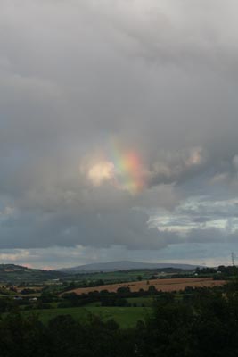
I initially was concerned with both the urban and natural landscape. This quickly changed as I decided I wanted to work purely on one view within the natural landscape. Concentrating purely on this one narrow view has given me the freedom to focus intensely on the things that inspire my work the most; atmosphere, light, elements and scale of nature (Genius Loci: Spirit of Place).

I thought I wanted to explore textile techniques and processes; this has become much less important as it is too restricting for the way I work. I love to work in a very immediate and spontaneous way, the textile techniques slows me down and can be frustrating. I want to work with a wide variety of media the important thing for me is to capture the immediacy of the vision or reaction to the landscape expressed in whatever medium I feel best captures it at the time. At present I am favouring pastel, pencil crayon or dyes used as watercolour. I am still enjoying the unpredictability of working on fabric pieces in an informal unconventional way.

At first I wanted to make very large-scale pieces to create impact and heighten the emotional response of the viewer. I still love to work on a large proportioned work but going too big brings with it a whole load of technical issues, and physical restraints. I feel the work becomes less personal and handling of the media is restrictive to my spontaneity.

I was thinking that the work would be more abstract in concept but I realise I still want to  maintain a sense of landscape, moving away from hard-edged geometry towards a more lyrical abstraction with a starting point in visual reality. Perhaps the more I absorb the landscape the work will become less representational and more an expression of feelings and emotional response.

I love the pure joy of the creative process, the journey of the unknown, how the piece will evolve. I am prepared to let the processes and media lead me as well as the response to the landscape so that I cannot predict an end result. I think this is really the heart of my practice.

The art movements I have been studying and feel relate to my work most strongly are:

  • Romantic Movement: Ruskin’s love for and intense study of nature and Turners use of light, softening of subject matter and unique approach to watercolour, working on site. Samuel Palmers moody, mysterious moonlight scenes, Constables sky’s and investigation into representation of nature alone having deeper significance and meaning.
  • Neo Romantics: Nash, Sutherland, John Piper and in particular David Blackburn’s pastel drawings. There love of a particular area and heritage.
  • Colourfield/Stain painting/Lyrical Abstraction: Helen Frankenthaler, Morris Louis, Joan Mitchell. Looseness of approach, paint not on the surface but part of the surface, bleeding of colours, allowing the medium to have some control over the outcome.
  • Land Art: Connection with how the elements and landscapes alter and change things or how elements of the landscape can be used to create marks. Andy Goldsworthy. Although not totally ruling it out yet, I feel that time based pieces are difficult to sit with my spontaneous approach. I could document myself working in the landscape producing work on site using the water and the mud, something I plan to explore in the summer.
  • James Turrell: I adore his use of light as a medium to create atmosphere, very ethereal and sublime work to be experience rather than looked at. An interest in celestial vaulting.
  • Impressionists: Monet, Whistler, abstraction of nature, repetitive painting of same view, atmospheric conditions, light, colourists, speed of production, working on site.

Initially I started my work by taking photograph of the landscape, and using them as a prompt to work from. I still wish to use photography, but I find them of less importance as inspiration, I prefer to draw on location as it translates and records my immediate emotional response in a more fluid way. I have gained a lot more confidence in my drawing skills. I also enjoy using the app on my phone to sketch on site, or later when remembering a view. This is a new medium for me; it has an organic feel working with my fingertips.

I have noticed the curvature of the landscape effecting my compositions, this has evolved naturally. I was interested to find that curvilinear perspective was used by the romantic artists, particularly Friedrich, as a device to produce an unsettling effect. This curve is inspiring my practice at the moment.

I have found my blog to be extremely helpful and have got rather addicted. It is a brilliant tool for recording thought, work and inspiration and keeping everything in chronological order. The best thing about it and the thing that surprised me most is the interactive quality. The supportive comments are immensely encouraging and having such a variety of people following me is overwhelming. It has helped me feel involved with the global creative community and grow in confidence.

Through the excellent and thought-provoking tutorials I have had I realise I need to question myself more deeply about what I am doing and why. Do I purely want to represent the landscape translated through the medium, or am I trying to translate my personal and emotional response subjectively into a piece of work? What is my emotional connection to this landscape? Does it connect somehow to its similarity to the flat, coastal landscape I grew up in? Do I use it as a sort of meditative trigger to set my mind free to evoke feelings and emotions? (Music is also important to me in this respect to help the fluidity of producing work.) Do I need to be more reflective? Perhaps my work is a poetical response? The answers to some these questions are slowly forming as I continue immersing myself in the landscape and in my practice, but others may always remain enigmatic.

Posted in Practice, Research and Development | Tagged , , , , , , , , , , , , , , , , , | Leave a comment

Found Object

I found this piece of board yesterday washed up on the Humber flood defences. Something about it really appealed to me, the contrast of gloss paint against the worn smoothness of exposed wood. I also noticed how the paint had cracked echoed the rivulets and channels in the mud when the tide is out. I am not sure why I kept it or what, if anything, I will do with it, I just liked it.

Found Object

Posted in Uncategorized | Tagged , , , , , , , , , | 1 Comment

Industry Sunset

Industry Sunset: Cherry Cobb Sands

Gazing at an awesome vista at the end of a lovely day and to make the evening complete a barn owl flew alongside the car for a few fleeting seconds, it was breathtaking.

Posted in Inspiration | Tagged , , , , , , , , , , , , , , , | Leave a comment

Why Distant Objects Please: William Hazlitt 1822

I feel a connection with this essay as it brings up many questions (and answers some) as to why I am constantly drawn to the distant views across the river. See extracts below.

Essay: “Why Distant Objects Please” by William Hazlitt from Table Talk, Essays on Men and Manners (1822)

“Distant objects please, because, in the first place, they imply an idea of space and magnitude, and because not being obtruded too close upon the eye, we clothe them with the indistinct and airy colours of fancy. In looking at the misty mountain-tops that bound the horizon, the mind is as it were conscious of all the conceivable objects and interests that lie between.”

“our feelings, carried out of themselves, lose their grossness and their husk, are rarefied, expanded, melt into softness and brighten into beauty, turning to ethereal mould, sky-tinctured. We drink the air before us, and borrow a more refined existence form objects that hover on the brink of nothing. Where the landscape fades from the dull sight, we fill the thin, viewless space with shapes of unknown good, and tinge the hazy prospect with hopes and wishes and more charming fears. ”

“Whatever is placed beyond the reach of sense and knowledge, whatever is imperfectly discerned, the fancy pieces out at its leisure; and all but the present moment, but the present spot, passion claims for its own, and brooding over it with wings outspread, stamps it with an image of itself. Passion is lord of infinite space, and distant objects please because they border on its confines and are moulded by its touch.”

“Distance of time has much the same effect as distance of place. “

Posted in Research, Research and Development, Uncategorized | Tagged , , , , | Leave a comment